Today I'm going to talk about shadows, specifically using the warp tool on your shadows to create a more realistic 3D look to your layouts.
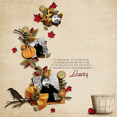
Using the warp tool on my shadows is usually one of the very last things I do on a layout, you want to make sure everything is how you want it before you do this. (so you don't have to redo it) Here's a layout I made using Lyndsay's kit
Crisp Days of Fall a colab with Julie Bullock
I am going to show you how I added a warped shadow to the stick element on this layout. First thing you should do is to add a regular drop shadow, I change ALL my drop shadows to the blending mode 'Linear Burn' which gives your shadow a more realistic appearance by taking on the color of whatever is underneath it as opposed to just plain solid black shadowing. (click on images to enlarge)
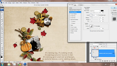
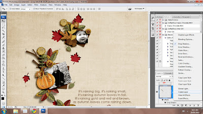
Next you want to put the drop shadow on it's own layer, right click on your layer styles on the element and select 'Create Layer' this puts the drop shadow on a separate layer below your element.
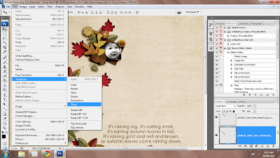
Make sure you have your new shadow layer selected and then go to Edit > Transform > Warp.
You will then see a grid over top of your shadow with points on the corners and different places across the grid which you can click on and manipulate.
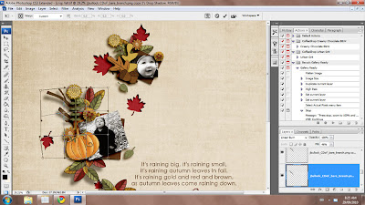
click and pull down where ever you want the element to look like it's farther away from the page. When you are done and you have the shadow how you want it press Enter.
If you feel like your shadow is too dark you can adjust the opacity or fill of the layer to make it lighter. You might also want to add a Gaussian Blur to the layer (Filter > Blur > Gaussian Blur) this will give a much softer look to your shadow making the element appear like it's coming off of the page.
Here is the finished layout with the new warped shadow, I also did the same effect on the lower branch at the bottom of the page.
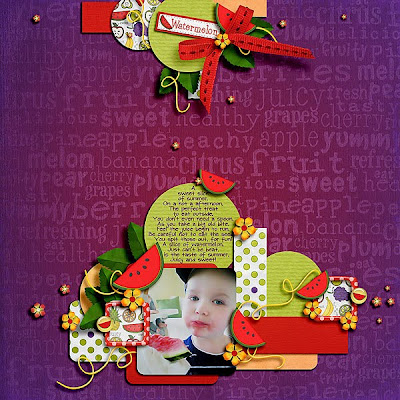
Here is another example of a layout where I used the warp tool, this page was made with the stunning kit Fruity Cutie by Lyndsay Riches & Kristin Aagard
I used the warp tool on the shadow for the bow at the top of the page.
Thanks for reading and I hope you find this helpful. :)
Lisa


No comments:
Post a Comment